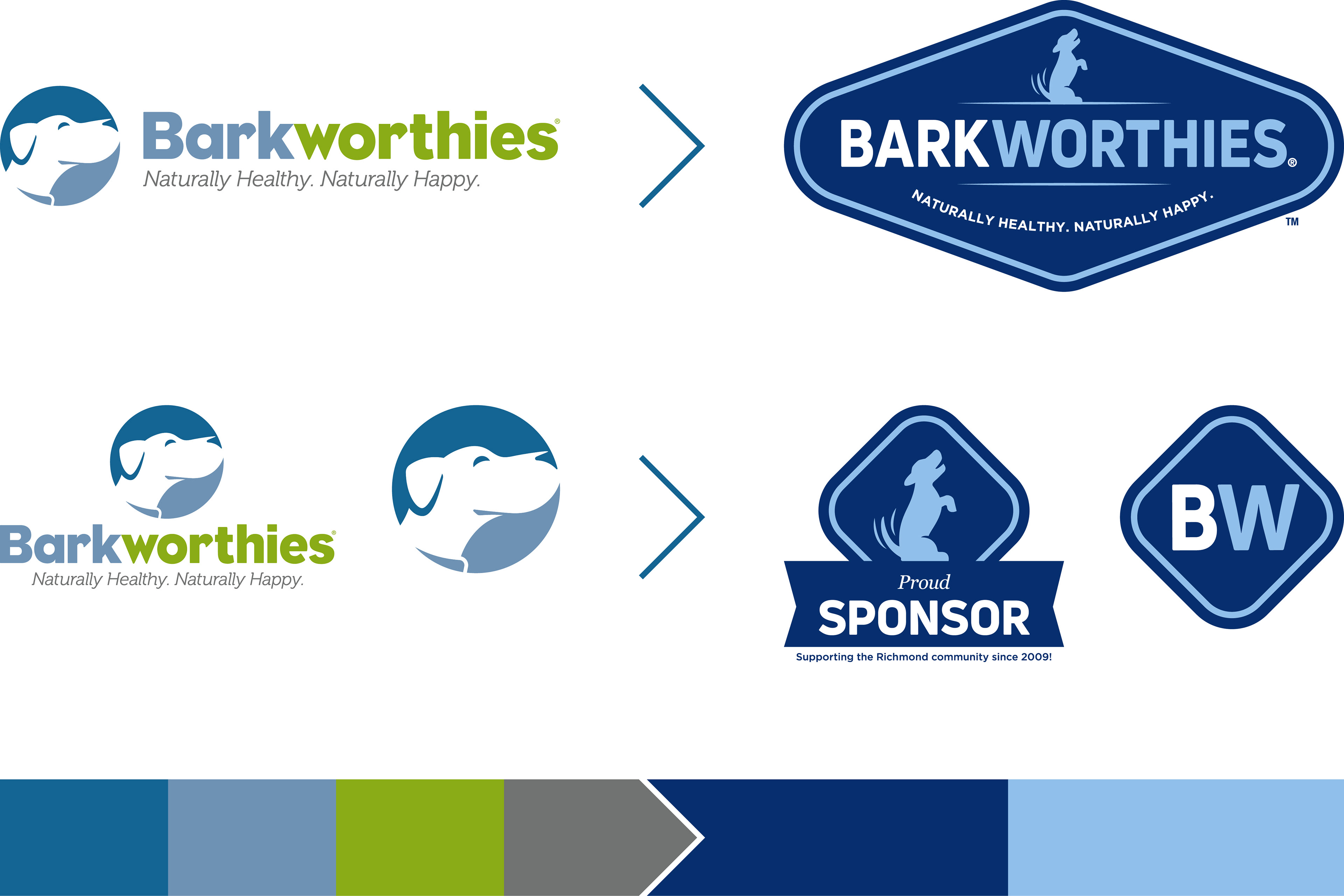
In 2018, I worked with the Bonfire Digital Agency to evolve the Barkworthies identity into more of a badge form to help bring the brand to the trusted, science based space.

We built the brand to stand out as the premium choice. We targeted the discerning, health-conscious dog owners by offering a variety of natural, limited ingredient chews and treats based on nutrition science and thoughtfully crafted recipes. Our target was the educated dog owner that went into boutique pet stores knowing exactly what they were looking for.

The Barkworthies brand was moving farther away from ecommerce. Therefore, the website needed to be more information based for any customer or distributor looking to learn more about what makes Barkworthies special or our new offerings.
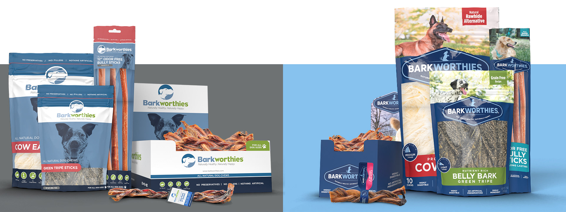
The rebranded Barkworthies packaging moved towards the natural aspect of the brand by using more nature photography of different dogs. We used the new logo as a premium promise badge. In addition to the redesign, we also rethought bag sizing, and removed the full cases, focusing only on the more modular and easily stocked mini cases.

For social media, Barkworthies focused heavily on the natural dog photography, science based nutrition, and the new chew meter which made it easier for customers to choose based on dog size, dog excitability, and the chewing occasion.
As I’ve worked with Barkworthies for six years prior to the current branding, the following outlines some of the projects addressed during those years.
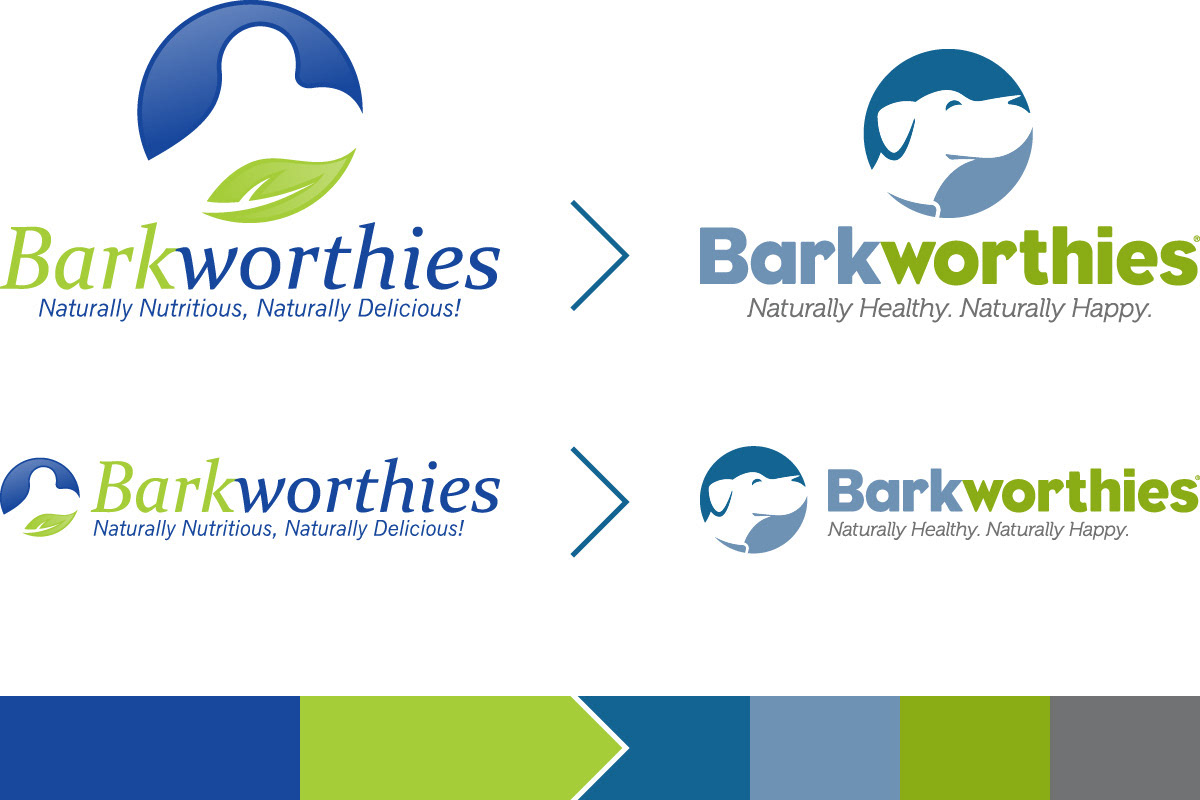
I worked with the Square Root Creative agency to evolve the Barkworthies identity in a way that paid homage to the original logo and maintained brand equity while bringing the look to a timeless state.

TDBBS, Barkworthies’ parent company wanted to embrace the fun spirit of their fuzzy clients. Plain stationary would not do. All stationary for TDBBS and the three main brands was designed to reflect their own look and personality. This included a branded flipbook sticky note pad used by employees and given away as SWAG at trade shows.


After the rebrand, I worked with in-house designers to populate the current packaging with new designs as well as to expand the look across new forms of packaging including backer cards, bone cases, and counter displays.
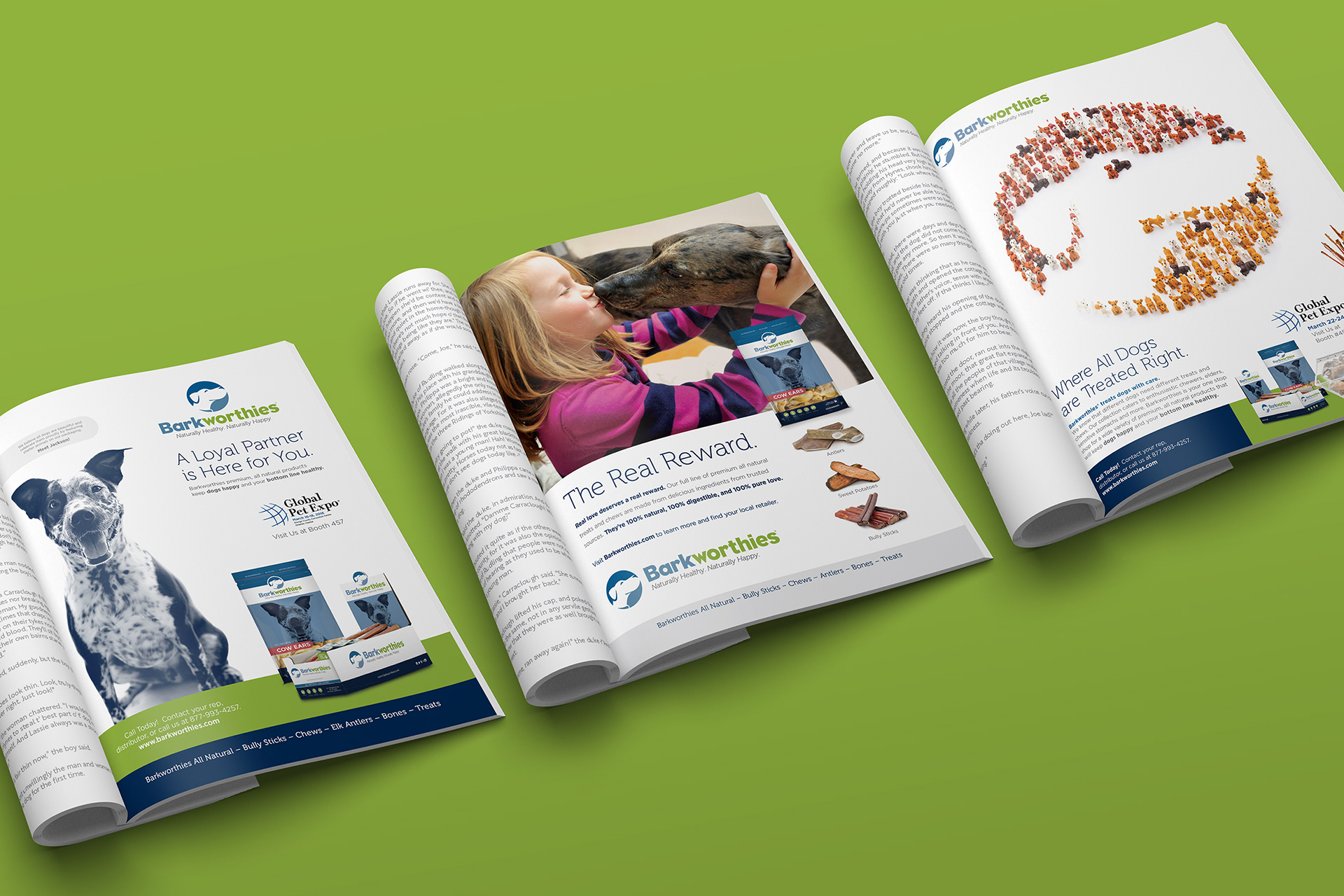
During the rebrand, I worked with Square Root Creative to create a consumer (left) and trade (middle) magazine ad template which was later evolved into different messages (right).
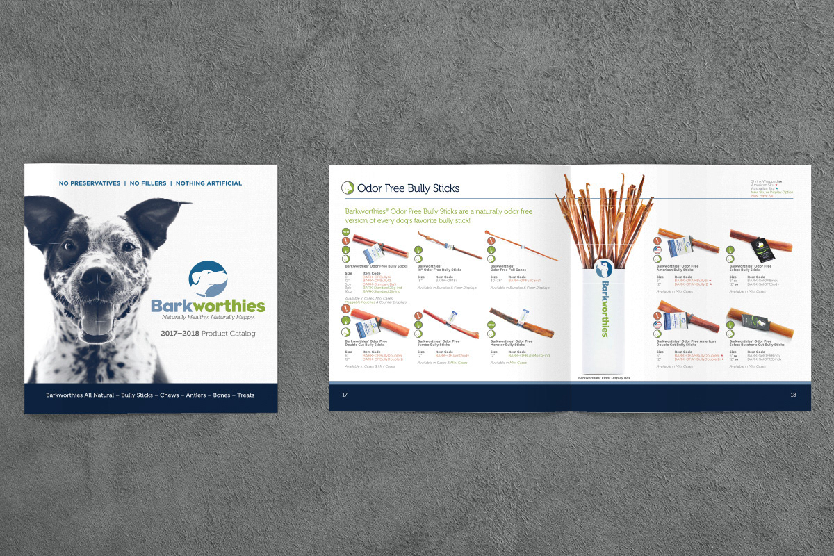
Post rebrand, I organized and designed the Barkworthies catalog handed out by our sales representatives while out in the field and during trade shows. The Barkworthies catalog must be rearranged and redesigned every year to accommodate new products and promotions.
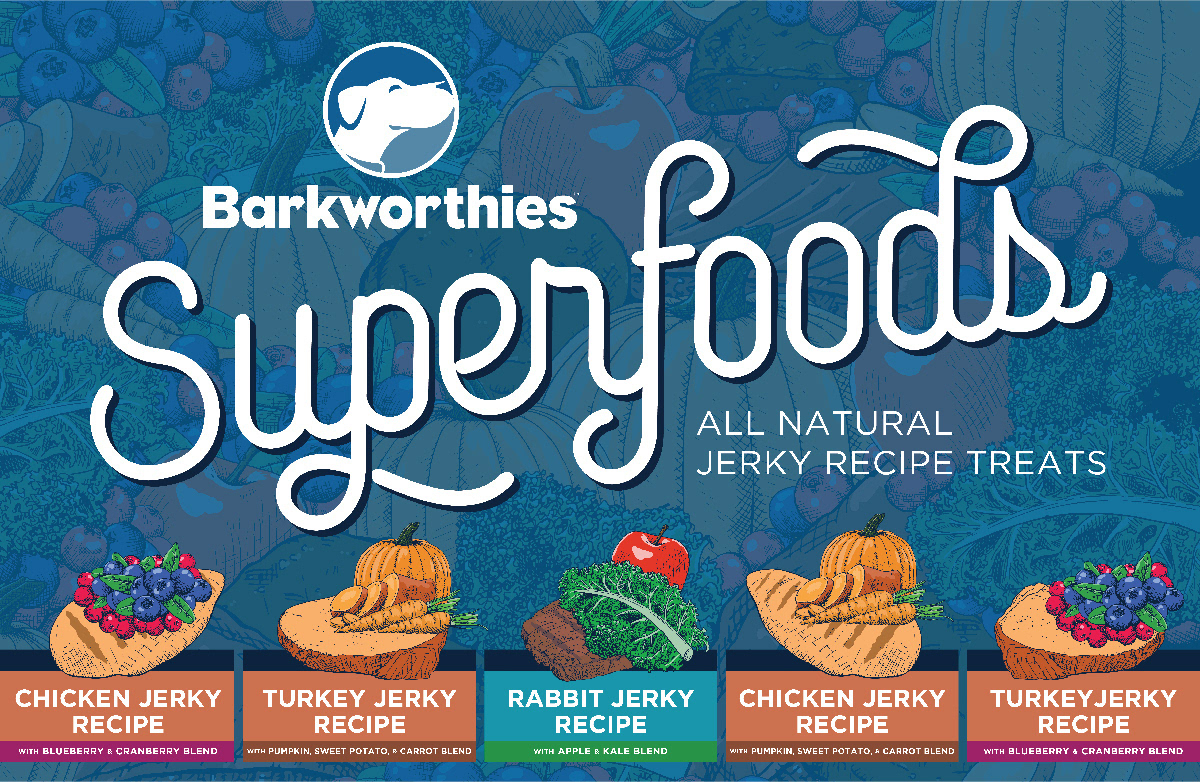
During the 2017 Global and Superzoo trade shows, Barkworthies launched their Superfood Jerky Recipes. With the help of an in-house illustrator, I designed this ad for the main real estate on the Barkworthies trade show booth.
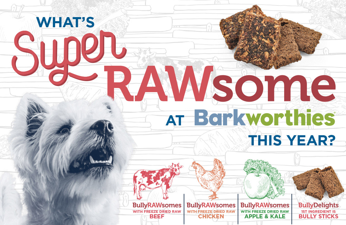
During our 2018 Global and Superzoo trade shows, Barkworthies launched their BullyRAWsomes and BullyDelights products. With the help of an in-house illustrator and photographer, I designed this ad for the main real estate on the Barkworthies trade show booth.
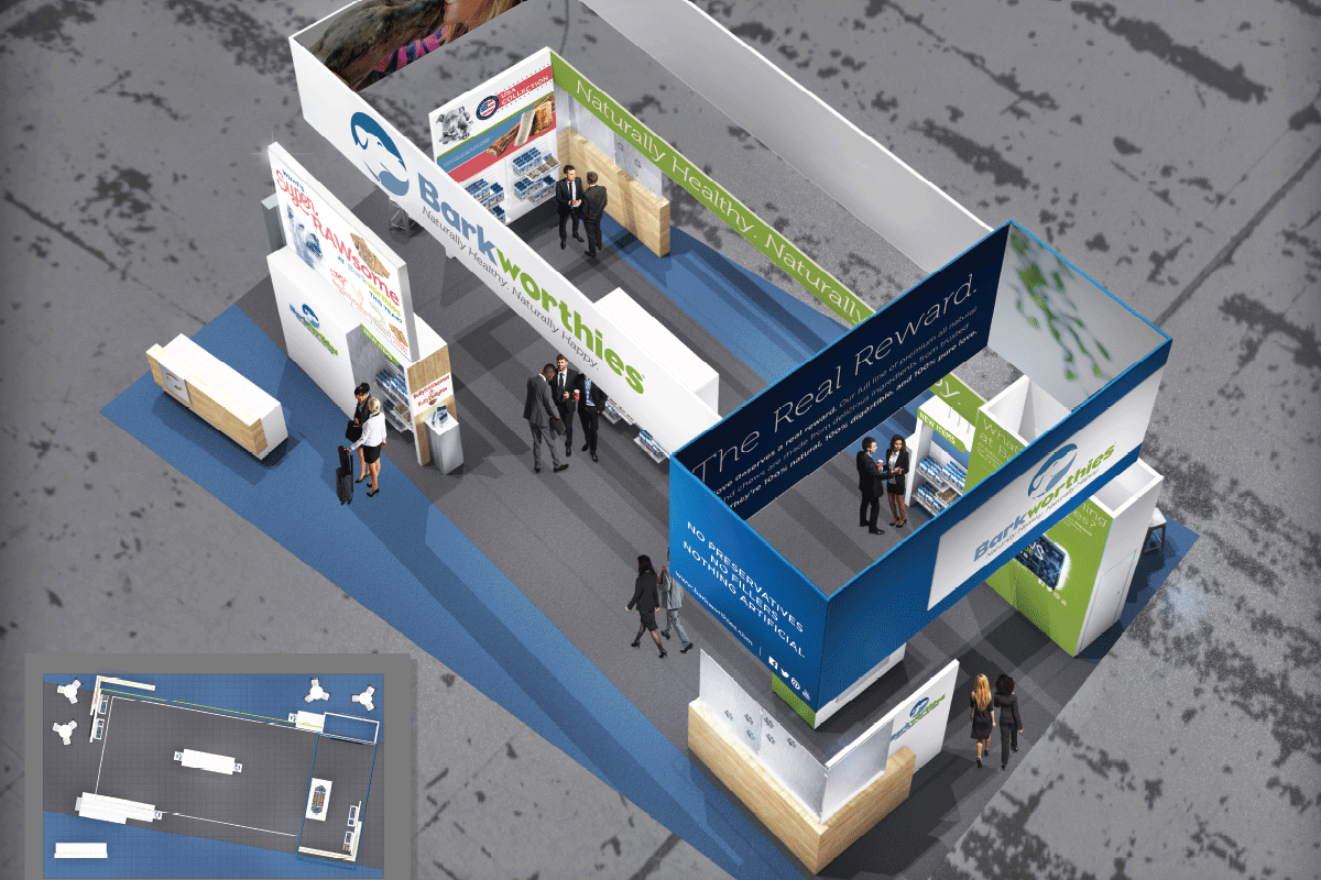
Shortly after the rebrand, Barkworthies hired Hill & Partners to design the structure of the Barkworthies trade show booth. I worked with Hill & Partners to fine tune the textures and purposes of the structures, as well as to apply the new branding to the printable panels. Twice a year, I tweak the design to reflect new messaging, product placement, and promotions.
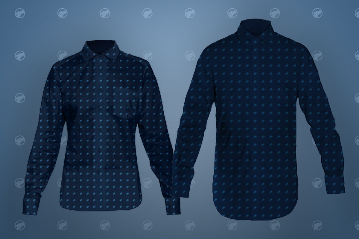
For the 2017 Superzoo trade show, I designed oxford shirts with a repeating Barkworthies logo for the sales representatives working the booth. The shirts worked to create a united branded force during the show and an appropriate business casual attire for client dinners directly after show hours. Representatives could also wear the shirts regularly out in the field.
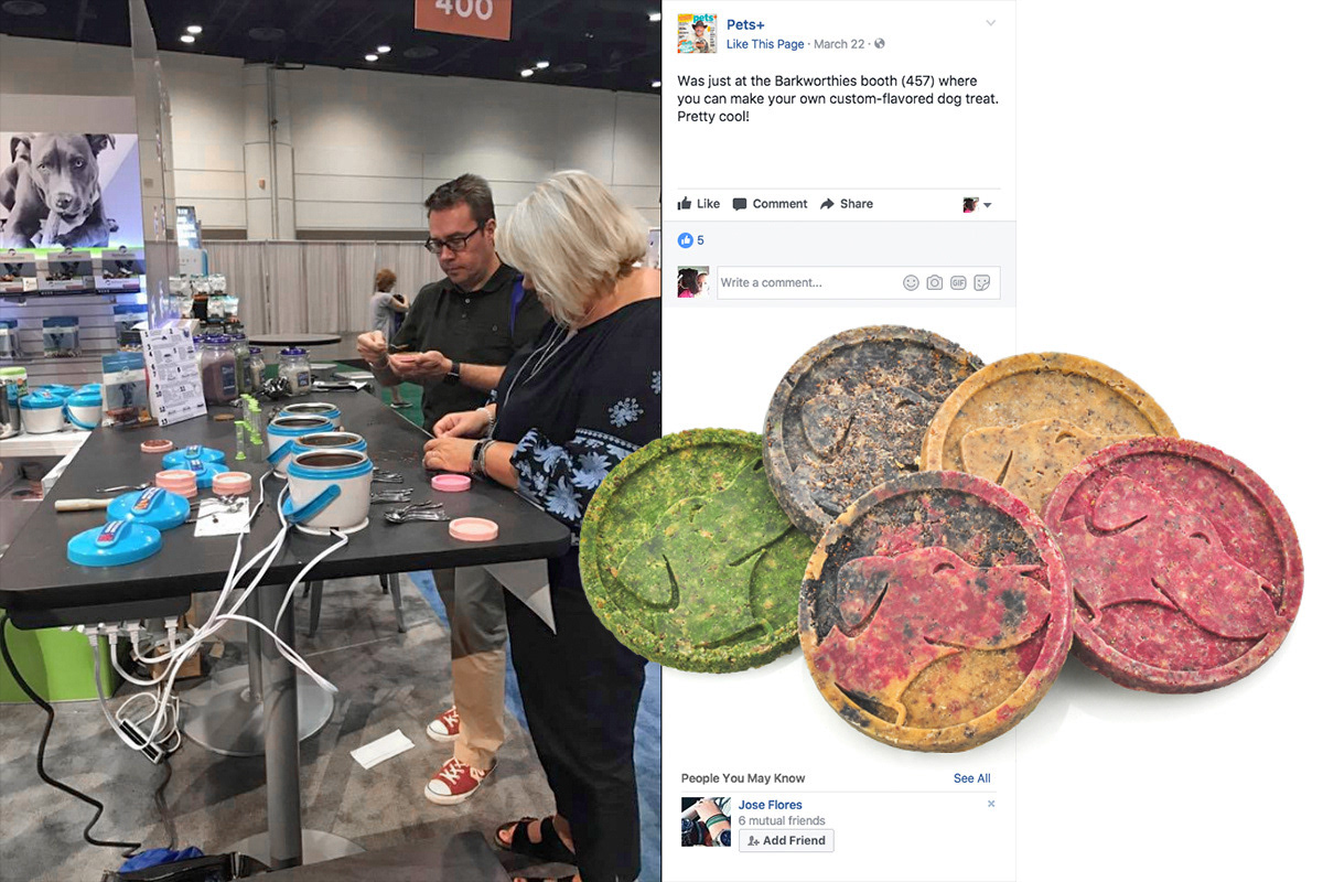
In 2017, I was tasked with finding a creative way to attract the passersby to the Barkworthies booth. Inspired by design conference vendors who set up DIY printmaking stations, I decided to make a DIY dog treat station. After a month of testing, the final set-up included a mixture of ground bully sticks, digestible soy wax, and four freeze-dried superfood powders heated in miniature crock pots. Participants choose their mixture of superfoods, fill a logo mold, and press the mold with frozen aluminum discs. The host hands the participant an hourglass timer and a ticket to claim the treat so they can wander the booth while their treat sits in the freezer for five minutes. When convenient, the participant would return and claim the durable Barkworthies logo dog treat they made with their own hands and take it back to their dog at home.
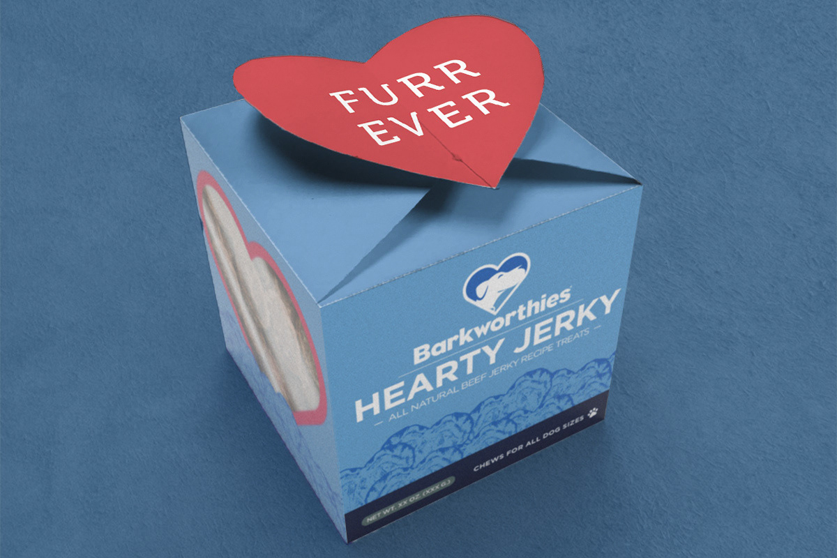
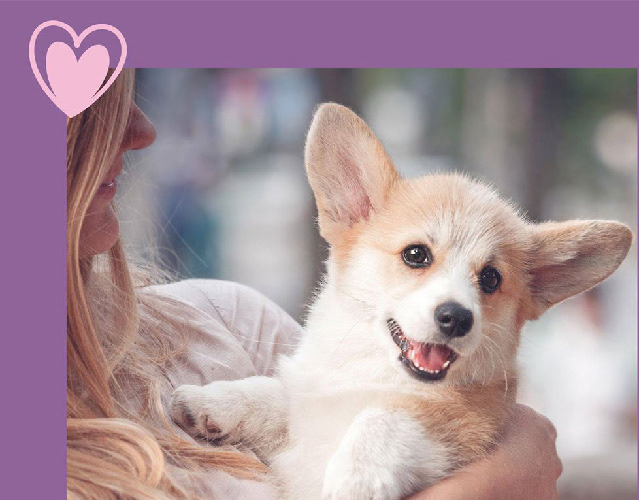
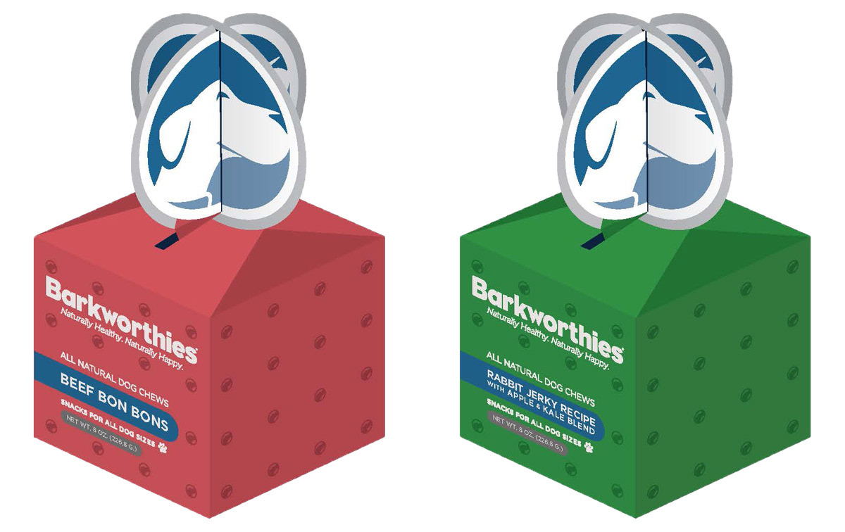
To prepare for PetSmart's 2019 holiday promotions, I worked with in-house designers, marketing, and new product development to come up with holiday specific products and packaging for Valentine's Day, Halloween, and Christmas. The Hearty Jerky box is a beef jerky box with a heart enclosure on the top that resembles the messaging you find on candy hearts.
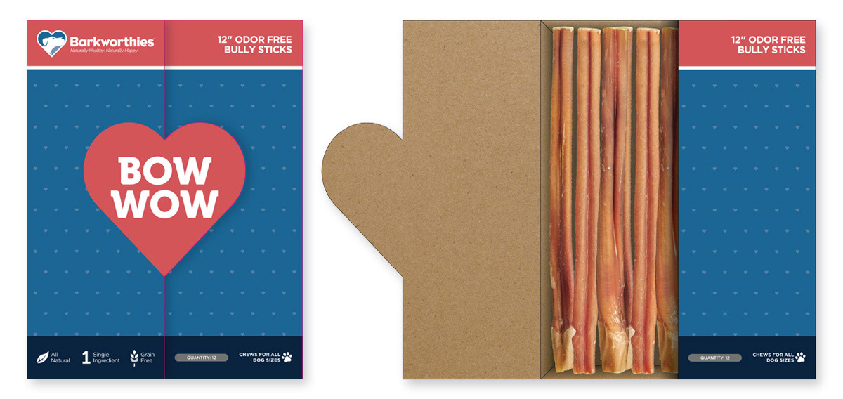
Sticking with the candy heart theme, we created a bully stick box with a heart enclosure that opened like a book. We also used the logo pattern idea from the trade show shirts as a slight texture for the background.

This example, keeping in line with the candy heart theme and logo pattern, features a single bully stick placed through a die cut on a card meant for a clip strip. The bully stick takes on the look of the classic Cupid's Arrow through a heart imagery.
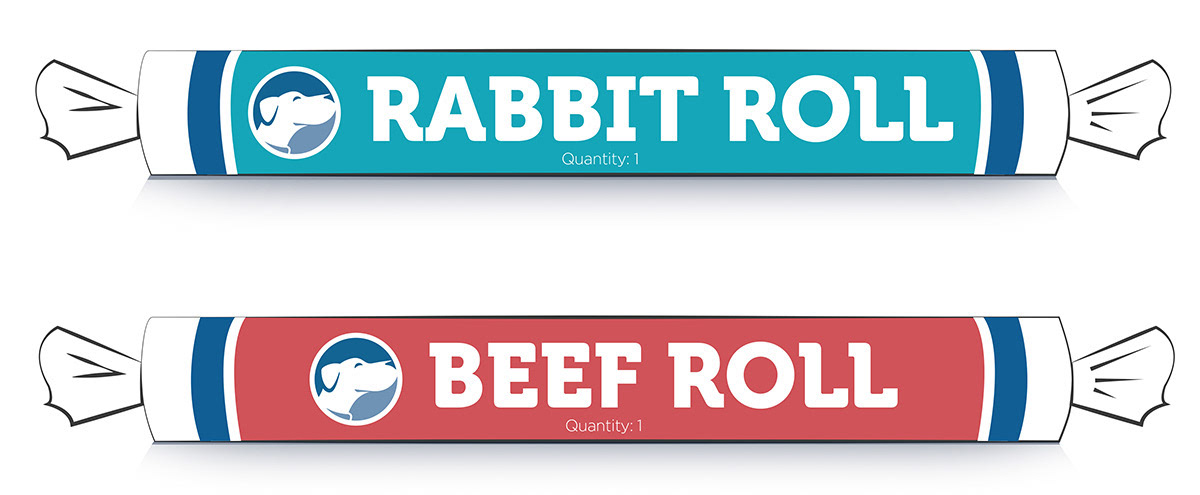
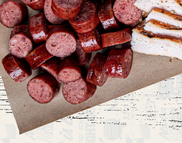
For this Halloween project, we used our existing beef and rabbit sausage rolls to emulate the iconic Tootsie Roll packaging. This piece was especially well-received due to the low production cost and the twist on traditional Halloween candy.
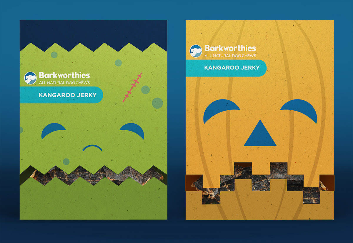
Using Frankenstien and Jack-o'-lantern illustrations made to reflect the style of the Barkworthies logo, we created Halloween counter display dispensers for smaller dog treats such as kangaroo jerky bites.
To play off the traditional Christmas gift box, we created small stocking stuffer boxes with the Barkworthies repeating logo pattern emulating wrapping paper, and a 3D logo enclosure acting as the bow.

Also for Christmas, we came up with a variety bully stick box containing bullies of different lengths. The window and the box are both in the shape of a Christmas tree with a light string pattern with the Barkworthies logo in place of the star at the top.
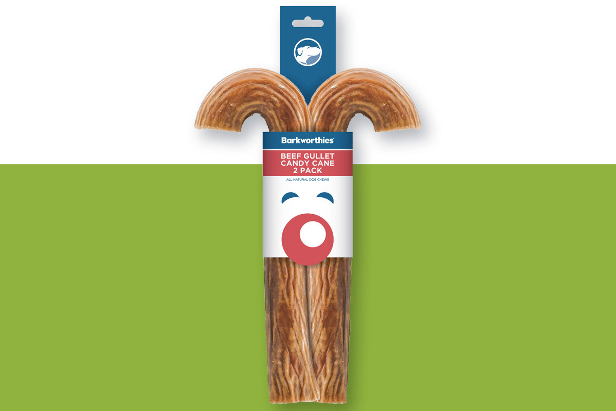
Using the style of the Barkworthies logo, we created a Rudolph reindeer made up of a clip strip sleeve wrapped around stuffed beef gullet canes acting as antlers.
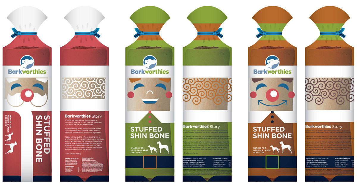
For this Christmas project, we created a line of stuffed shin bones wrapped in bread bag style packaging. Each bone in the line represented either Santa or one of two elves illustrated with the smiling style of the Barkworthies logo.