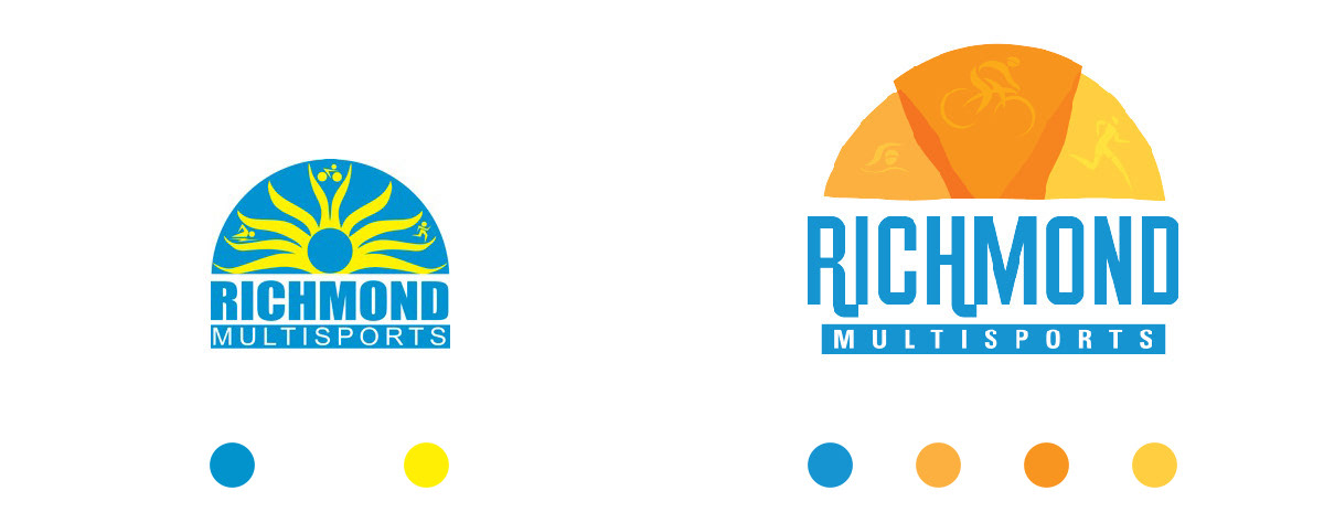
The original logo was focused on a sun shape with icons featuring the three activities within a triathlon. To evolve the logo, I maintained the sun ray idea with triathlon imagery which could be accentuated or pushed back depending on the logo application. I also changed the colors to be more friendly and warm along with the typeface which became more playful.
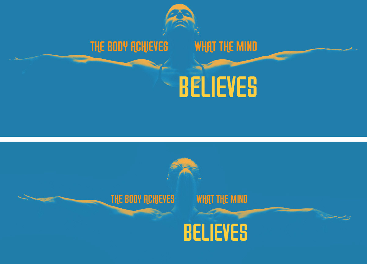
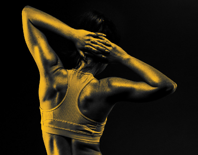
On Richmond Multisports’ Twitter and Facebook pages, I created covers to be applied between races. The covers included simple duotone images of the front or back of a strong bodied woman stretching her arms out with the words, “The body achieves what the mind believes” placed behind and in front of her body. The duotone became a strong element of Richmond Multisports’ visual language.

To attract race sponsors, we created a brochure to go over the benefits of sponsorship at each package level. I chose a gate-fold brochure style so that the potential sponsor could be led one step at a time through the thought process of why to sponsor Richmond Multisports, what does the sponsor get in return, and the people to contact listed on the back.
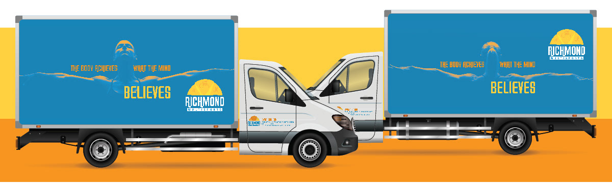
To transport the race equipment to and from race locations, Richmond Multisports had a box truck. To wrap the truck, I used the same imagery used on social media so that followers would instantly recognize the event truck if they saw it on the road.
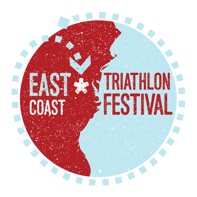
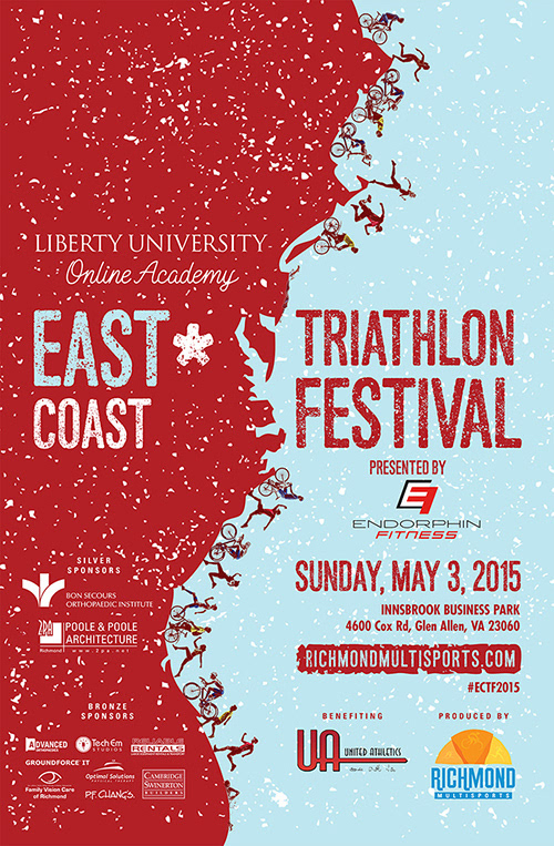
The East Coast Triathlon Festival invited athletes from up and down the East coast to come to Virginia and participate in the race. I used this idea within the event logo using a dotted line circling the East coast, and ending in the general location of the race. For the poster, I expanded on this idea showing profiles of runners, bikers, and swimmers racing up and down the flat coast toward Virginia.
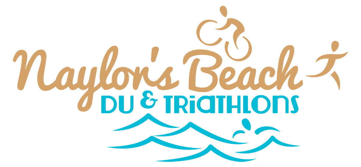
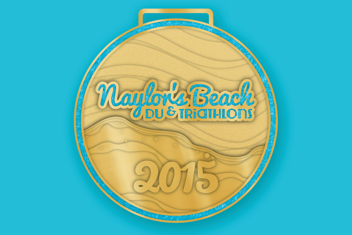
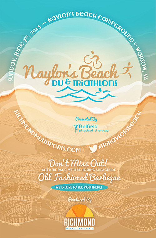
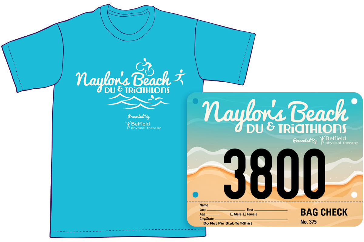
The Naylor’s Beach Du & Triathlons was a scenic race around Naylor’s Beach Campground. I used traditional beach colors and a calm script to create a course for triathlon icons to race on within the event logo. For the poster and bib, I continued with the beach imagery, and added the shoe prints of beach racers across the sand.

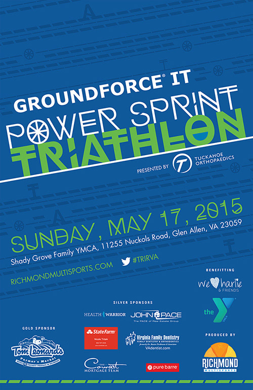
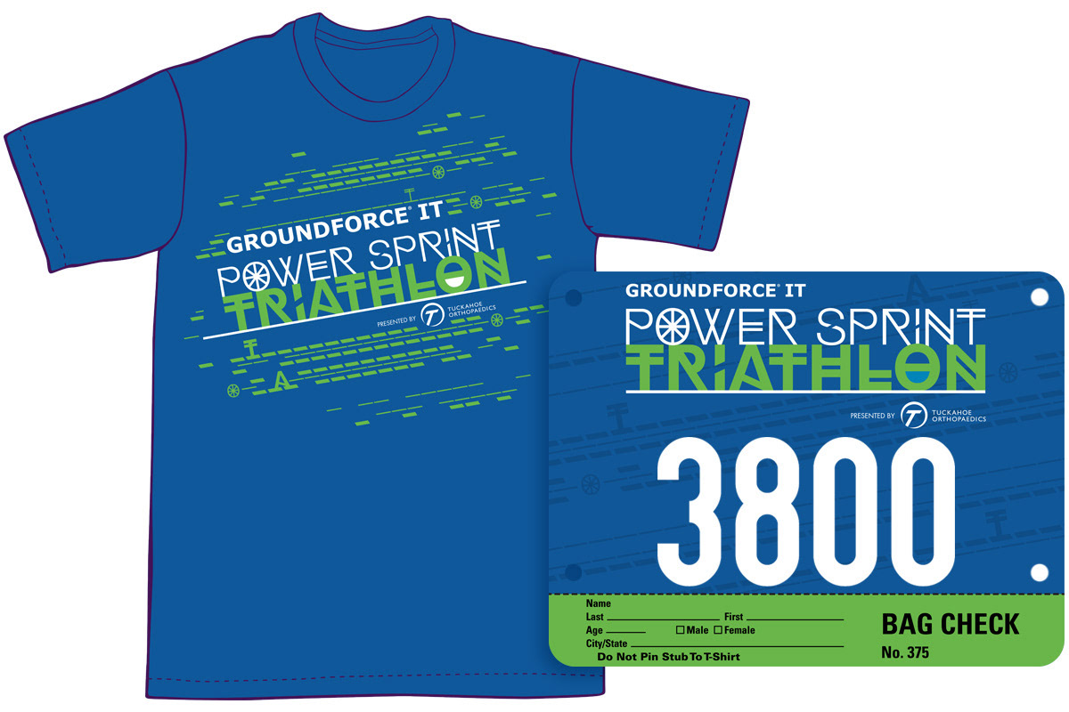
A sprint triathlon is a quick version of the traditional triathlon. Each section typically covers about a quarter of the regular distance. With that in mind, I used a linear pattern and a diagonal layout to convey the idea of speed within the poster, bib, and shirt. The logo features a typeface with execution style changes with each letter as the athlete will have to change tasks quickly as well within the race.
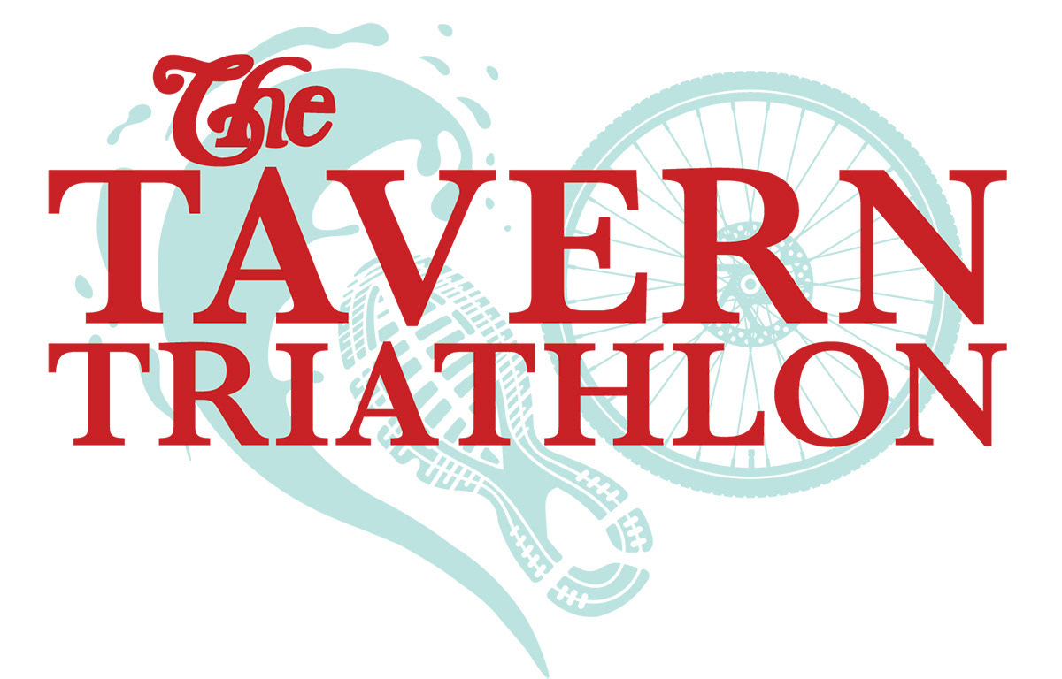
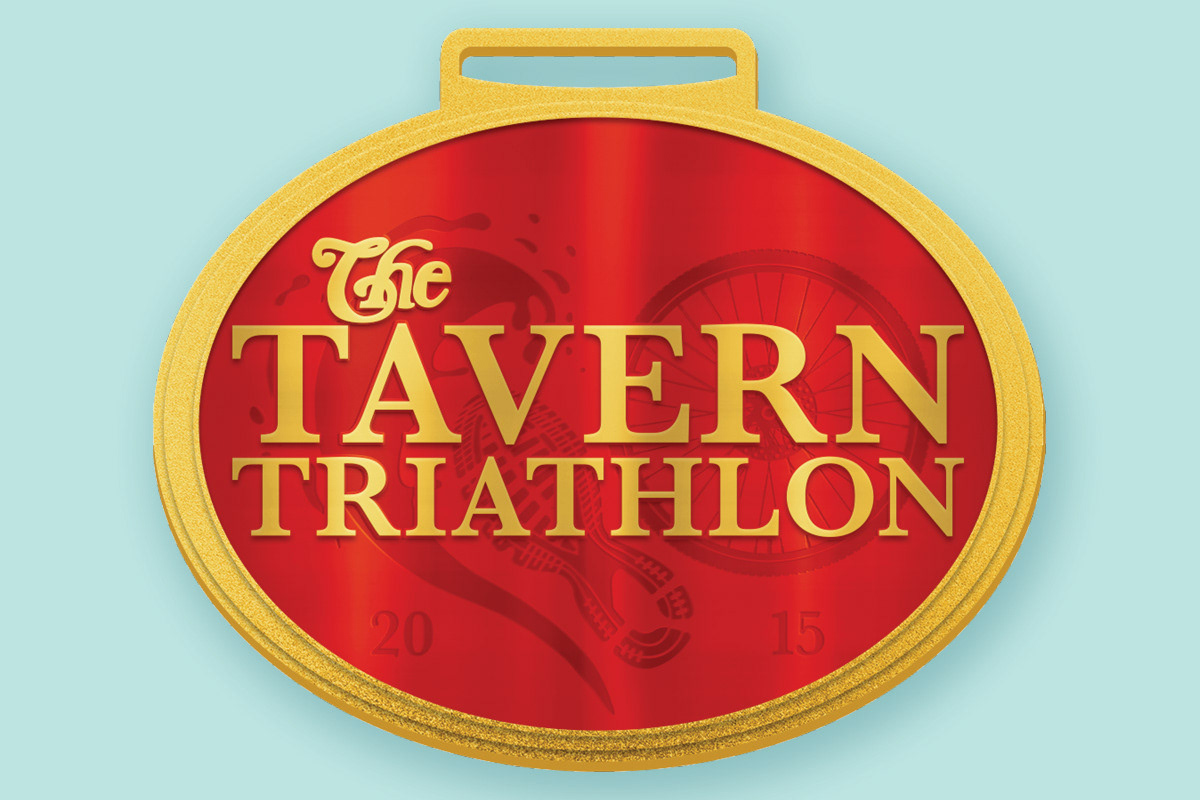
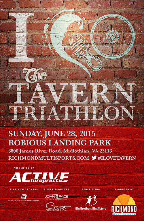
The Tavern Triathlon was created around the location of a favorite Richmond restaurant. Their logo on their website shows “I (Heart) the Tavern.” For the logo, I used that idea and combined the shoe print of a runner, the wheel of a bike, and a splash of water into a heart shape behind the typography. The poster and bib feature the brick wall of The Tavern and the red of the heart in the logo.

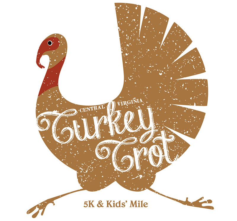
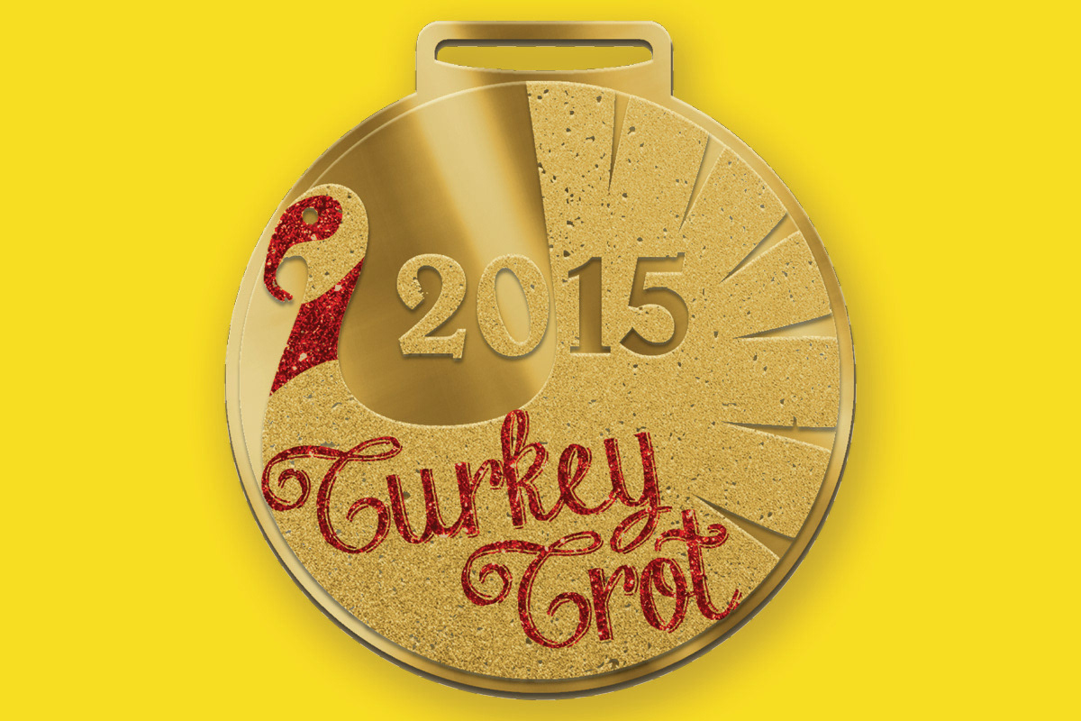
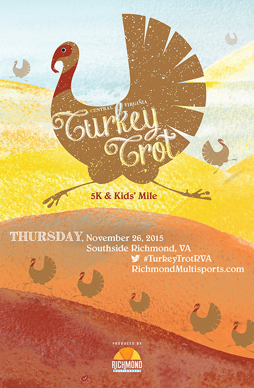
The Turkey Trot was a Thanksgiving running race and kids' mile. For the event logo, I used the image of a running turkey. This logo was repeated to look like turkeys running up and down a landscape of autumn hills in an illustrated style appealing to children for the graphics used in the poster and bib.